Module - Aims
The module provides a practical starting point, giving opportunities for the student to experience the working practices of the photography department. There are usually variations in student experience and expertise upon entry, and the planned curriculum exists to partially compensate for these variations. This will reinforce student confidence by introducing departmental systems, equipment, processes and practices in an accessible way.
Module - Content

Large Depth of Field

f/number - depth of field
 Factors affecting depth of field
Used for:
Portraits where you want to control background sharpness.
Shots where you want to emphasise small detail.
Creating soft mood.
Shutter priority is when you set the shutter speed you require and the camera selects the correct aperture.
Program (P) is for when you just want to snap away and give little thought to settings.
Manual exposure (M) is when you have time to concentrate on accurate exposure for maximised capture quality.
My original image -

I carried out the following actions:
Selection around the central flowerhead, inverted and feathered 250 pixels. I used levels to slightly darken the outer area. I blurred the selected area using Gaussian blur. I repeated the darkening and blurring on an area around the flowerhead but wider this time to make the vignette and blur stronger as it moved outwards.
I again selected an area close around the flowerhead in a similar shape to the first selection and used the colour channels to tone down the green colour cast commented on by Richard in his appraisal of the image.
Using curves on the selected area I subtly increased the contrast of the image.
I used unsharp mask to bring out the detail in the minute hairs on the edge of the petals.
I inverted the selection and converted the outer area to black and white using the black and white adjustment within photoshop.
I resized the image to 12x8 300dpi. It was already a tiff file because college photoshop is not up to date enough to read the RAW files from my camera.

I am not sure if I preferred the image without the final step but asked around in class and was satisfied that the effect was good with the black and white. I used this primarily as a photoshop exercise reassured by Richards comment in class that this might not be the best photograph we have submitted it is more important that we master these particular techniques. I had to carry this out between lectures in class as I don't have photoshop at home.
Had it been within the rules I would have finished the image in Aperture and would have submitted the following -

I have tried to carry out the same steps within Aperture but there does not seem a way of selecting an area of an image. I am currently looking through plugins to see if there is a way of doing it. I have also downloaded Gimp which appears to do more and will try the same with this.
References
http://help.adobe.com/en_US/Photoshop/
http://staylost.livejournal.com/32216.html
http://notesofgenius.com/adobe-photoshop-cs4-getting-started/
http://www.easyphotography.info/
Sunday 18th December 2011
Portfolio printed and boxed ready for assessment.
Module Summary
During the first semester in Systems and Processes we have been taught different photographing techniques appropriate to different subjects in the form of the weekly picture project. The weekly task was carried out over two weeks - lecture one week and assessment of the resulting image in class the following week.
The resulting portfolio of 6 images would be printed and submitted for assessment.
Before submission the images were evaluated individually bearing in mind any feedback I had received from Richard. Each week I took more than one image and Richard chose which to give feedback on.
My own evaluation of the images to be submitted is in three parts:
Does the image follow the brief and does it exhibit a creative/original approach to the subject?
Is it technically proficient? Is it in focus? Level? White balance correct?
Does the final print follow what is on the screen? Does the monitor need calibrating? Does the choice of ink and paper require a new profile to be set up?
Week 1
Street photography - we were tasked to look at Blackburn with fresh eyes as if we were visitors.
My image - I used my Canon G12 compact camera to photograph the statue of mother and child outside the railway station. I used my compact because at the time I was very self concious when photographing in the street. (These days I just take pictures without thinking about it) I positioned the camera on the ground by the teddy and, using a narrow aperture to get the depth of field wide enough for the child but not the mother in focus, took some photos. Out of the corner of my eye I spotted a little boy watching me so I moved slightly to include him.
No processing was needed apart from conversion from RAW to TIFF. The white balance was correct and I left the horizon as shot because it suited the image. I am impressed with the way the sensor coped with the high contrast image.
I am pleased with the result but it is a shame the baby in the pushchair is not more visible - I didn't see him until I uploaded the photo.
Week 2
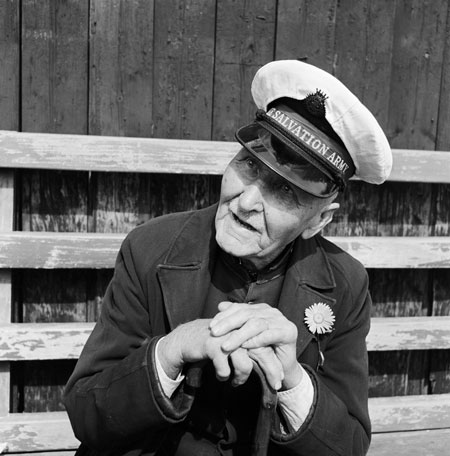
Black and White Portraits - using wide aperture to create a narrow depth of field. I had not done any portrait work before so was hesitant in getting started. Once I had got going I loved it. The submitted image of 9 year old Patrick came out really well.
I used my Canon 50D DSLR with a 50mm f/1.8 lens set at 1.8 in aperture priority. He had just finished school, I sat him on a stool near to a window which lit him from the right and got him to talk about his day. Initially his reaction was to try to keep looking at the camera and smile but he soon forgot and chatted away naturally. I set the focus matrix to just one point level with his right eye and kept him more or less square on to me so both his eyes would be in focus.
The image was converted to black and white in Aperture and the contrast was altered so that there was a full range of tones from white to black.
Week 3
Black and White Landscape - using long exposures and hyperfocal distance. From the start I knew the image I wanted but was not sure if I could produce an effective image. Ged's Bench is on Darwen Moor, Ged had a tragically short life and his family placed this bench in his name on the moor. I had two choices get up very early and shoot at dawn or go up in the daylight and wait for dusk. I went up during the day and did some test shots, measured where my hyperfocal focus point would be and reviewed the images on my computer. I returned later that day and set my DSLR with zoom lens at 15mm on my tripod suitably weighted down. As the sun went over the horizon I began shooting finishing when it became completely dark.
The images needed processing as they were mostly dark and muddy looking. As I shot in RAW I was able to recover the detail in the sky and foreground. I converted to Black and White using Silver Efex Pro plugin in Aperture. I am pleased with the result.
Week 4
Flowers in a vase. I bought some flowers and set to work in my home built studio. I placed the flowers in a vase on my product table and lit them with a pair of umbrella lights. Richard chose my photo of three flowers against a dark background. It was not the one I would have chosen and it was not a satisfactory image when printed. The edges of the petals against the dark background looked like cutouts. At this time I had begun using a medium format film camera and was put off by the overly clinical results given by digital. The image I chose to print and submit with my portfolio was a black and white conversion showing two flower heads one of which had beads of water like crystal balls. The wide aperture on my 50mm lens gives a really effective shallow depth of field.
Week 5
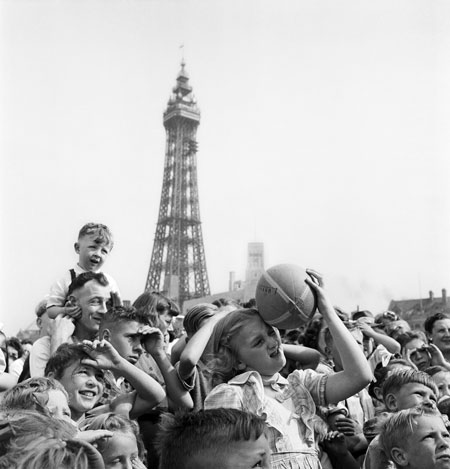
The Great British..... I chose Blackpool as the Great British Seaside Resort. I walked along the front photographing people and landscapes. The image I chose is a long view following the coastline towards the Pleasure Beach. I shot into the sun taking in the reflection of the sky on the wet steps. I used an aperture of f/11 for a reasonable depth of field without compromising on the shutter speed as I was using the camera handheld.
I chose this image as it has all the elements of the british seaside - clouds, low wintery sun, fairground and brown seawater.
Week 6
Photoshop - Richard gave us a list of 16 actions to be carried out in Photoshop. The task was to attempt at least 10 on one of our images.
I chose a photograph of foxgloves on which I carried out 10 of the listed actions and produced the submitted photograph. It was an interesting result which got good feedback from my peers but was not to my taste. I used the task as an opportunity to hone my Photoshop skills and I am satisfied that I can complete the full 16 (but not necessarily on one image).
During the course of this module I have used both my compact and DSLR. Both shooting RAW. The DSLR has its advantages in lens choice but the compact can be used more discreetly.
I have also been using a Bronica medium format film camera, processing the negatives myself and scanning them using the college scanner. I have not submitted any of the film based images in this module but hope to do so in the future as my skills develop.
I catalogue and process my images using Aperture on my Mac at home and use Photoshop on the college computer. I have been introduced to Lightroom in class but have not found any benefit over Aperture for my requirements as it seems to have the same functions of cataloguing and editing.
Module - Content
You will have open access at certain times to studios, lighting equipment (with accompanying health and safety training), ‘silver’ darkroom facilities, digital darkroom technology (such as software and print facilities) and staff support. The unit will also allow opportunity for visits and outings to encourage social interaction within the student group. The assessment will take place at the end of Semester A.
Tutor - Richard Peregrine
20th September 2011
During this lecture Richard introduced the weekly picture project which will run through the semester. Each week we will be given a lecture and the task will be to take a photograph to demonstrate that we have understood the lecture.
A major part of the lecture was devoted to looking at photographs which had three elements:
I enjoyed viewing the photographers websites and browsing through their images. The above are a sample of the images I found particularly good. I loved the spontaneous humour found by Ian Berry and Matt Stuart. I can admire the ability of Gregory Crewdson but his images are not to my taste. Julia Boggios ability to make an artform of wedding photos with seemingly endless imagination makes me wish I had seen them when I got married 20 odd years ago and was stuck with a boring procession of staid images of people in unfamiliar outfits. (it would have been worth the price to see the expression on my then prospective father in law)
The task for Week 1 was to make a triptych of photographs that examine an aspect or subject in Blackburn that is unusual or out of the ordinary bearing in mind Matt Stuart and Ian Berry.
I found this task very difficult to begin with as did others in the group. The ability to happen upon the decisive moment with camera ready is seemingly impossible.
I finally settled on three photographs

The first was taken with my compact camera which thankfully has an articulating screen. I placed the camera by the teddy and used f/8 to get the child in focus but not the mother or background. I used the widest focal length to enlarge the teddy and the hand. After several shots I saw a small boy watching me so I waited till he moved closer to include him in the picture.

The second was a straightforward view looking down on Blackburn Rovers Ewood Park, I like the incongruity of the highland cattle in East Lancashire.

The third was one of several I took of Wainrights Bridge. The usual view is from a distance showing the blue spans arching against the background buildings. I wanted to look at it differently but keeping some buildings to put it into context with the surrounding buildings. I like the strong leading lines the bridge gives.
References:
http://www.ianberrymagnum.com/
http://www.photographymonthly.com
http://www.magnumphotos.com
http://www.mattstuart.com/
http://www.whitecube.com/artists/crewdson/
http://www.mymodernmet.com
http://www.juliaboggiophotography.com/
27th September 2011
The lecture started with a discussion on 'the golden hour' and the quality of light at different times of day and in different countries.
Two examples were shown:
Weekly Photos
Each week a lecture will be given and the task will be to take photographs to demonstrate we understood the lecture. Our photograph will be uploaded to flickr and added to our flickr group aperture4001.
Richard named several photographers and we looked at their work and discussed the images.
Jane Bown - A portrait photographer who photographed famous people in their own environment. She had a simple approach to the picture. She worked handheld talking to the subjects, allowing them to relax and she captured expressions and poses which were very natural. From the images she apparently built up a rapport with the subject very easily. The exception being Edith Sitwell who remained stiff and unmoved throughout the shoot
By comparison the rapport with Bjork shines out of the photograph. Bjork looks relaxed and is clearly enjoying the session.
Lee Freidlander - A photographer who photographed scenes in America in the 50s and 60s. He used reflections, his own shadow and symbols to compose the images. The example below shows a window reflection and a shadow against a chair. All quite ordinary in isolation but put together create an effective image. All these elements need to be used properly to compose the image, any one in the wrong place or shown by accident can distract the eye and spoil the shot.
Henri Cartier Bresson - An expert in the art of the decisive moment. His images are beautifully composed and contain the element of spontaneity which is very striking. The moving subjects in his shots are captured in the most effective position to complete the image. The below image has the appearance of a hall of mirrors reflecting into the distance. The jumping child on the right was caught in the perfect position.
Jimmy Forsyth - He photographed an area of the West End of Newcastle, Scottswood Road. He had no formal training he knew his subjects and recorded them honestly. As he was part of the community there was no barrier between him and his subjects. He recorded his thoughts against each image and these comments are as interesting as the images themselves. His note on the below image was - "Maureen Beveridge on the corner of Oak Street and Suffolk Street. Sometimes I like to see my shadow. It shows that it was me that was taking the photo" Maureen was clearly relaxed in his company and very proud of her new coat.
Annie Leibovitz - I have seen a documentary about her life and work. She has produced some of the most famous portraits published in Rolling Stone and Vanity Fair magazines. Her portraits always provoke a reaction because of her unconventional approach. She has had a fair amount of criticism, not everyone appreciated the aesthetics of a heavily pregnant nude Demi Moore. Her extravagant shoots and lack of business sense have nearly bankrupted her despite high commission fees. The two images below show her wide range of work.
During this research I found a further photographer John Gay who photographed English life over a period of around 60years. There are examples at the national portrait gallery of his portraits of famous people but more interesting for me were his street scenes. Candid street scenes which are interesting and provide a vivid record of times gone by.
Richard then introduced us to getting our photos assessed in a group setting as he viewed the photos from week1. A daunting experience which I really hope will get easier as time goes on.
References:
http://blogs.telegraph.co.uk/culture/neilmccormick/100056389/pink-floyd-to-reunite-pigs-will-fly/
http://www.progarchives.com/artist.asp?id=364
http://www.atgetphotography.com/The-Photographers
http://www.amber-online.com
http://www.kenrockwell.com
http://www.pbs.org/wnet/americanmasters
Jane Bown - Exposures
John Gay - England Observed
4th October 2011
The lecture today was all about the functions and most effective use of a dSLR. This was leading up to the weekly photo project.
The functions of a camera:
In normal circumstances the sensitivity is set at the start of a shoot and remains constant.
The choice of exposure mode is also likely to remain unchanged.
This leaves exposure and focus as the final technical steps before the image is composed, visualised and captured. The less time spent on the first 3 functions leaves more time to capture the image.
Shutter speed and Aperture size are inversely proportional which means as one is increased, the other must be decreased. The adjustment increments are called stopped. Stops can relate to aperture size, shutter speed or ISO.
Every situation has a light level. The photographer makes the adjustment nesessary to suit the nature of the photograph.
ISO is set to suit the general light level.
Aperture determines the depth of field.
Shutter determines capturing movement.
The photographer decides the priority.
At this point Richard got nostalgic and gazed at a photo of a Nikon FM which is a fully manual camera.

My own experience of a manual SLR was less glamorous.
 Depth of Field
Tutor - Richard Peregrine
20th September 2011
During this lecture Richard introduced the weekly picture project which will run through the semester. Each week we will be given a lecture and the task will be to take a photograph to demonstrate that we have understood the lecture.
A major part of the lecture was devoted to looking at photographs which had three elements:
- The Decisive Moment
- Juxtaposing
- Visual Irony
 |
| Ian Berry |
 |
| Matt Stuart |
 |
| Gregory Crewdson |
 |
| Julia Boggio |
The task for Week 1 was to make a triptych of photographs that examine an aspect or subject in Blackburn that is unusual or out of the ordinary bearing in mind Matt Stuart and Ian Berry.
I found this task very difficult to begin with as did others in the group. The ability to happen upon the decisive moment with camera ready is seemingly impossible.
I finally settled on three photographs

The first was taken with my compact camera which thankfully has an articulating screen. I placed the camera by the teddy and used f/8 to get the child in focus but not the mother or background. I used the widest focal length to enlarge the teddy and the hand. After several shots I saw a small boy watching me so I waited till he moved closer to include him in the picture.

The second was a straightforward view looking down on Blackburn Rovers Ewood Park, I like the incongruity of the highland cattle in East Lancashire.

The third was one of several I took of Wainrights Bridge. The usual view is from a distance showing the blue spans arching against the background buildings. I wanted to look at it differently but keeping some buildings to put it into context with the surrounding buildings. I like the strong leading lines the bridge gives.
References:
http://www.ianberrymagnum.com/
http://www.photographymonthly.com
http://www.magnumphotos.com
http://www.mattstuart.com/
http://www.whitecube.com/artists/crewdson/
http://www.mymodernmet.com
http://www.juliaboggiophotography.com/
27th September 2011
The lecture started with a discussion on 'the golden hour' and the quality of light at different times of day and in different countries.
Two examples were shown:
 | |
| Bankok Skytrain |
 |
| Pink Floyd Animals |
Each week a lecture will be given and the task will be to take photographs to demonstrate we understood the lecture. Our photograph will be uploaded to flickr and added to our flickr group aperture4001.
Week 2 photograph is a black and white portrait, focusing on the eyes of the subject and setting a wide aperture to maximise the bokeh effect. Bokeh is described by Ken Rockwell as "Differing amounts of spherical aberration alter how lenses render out-of-focus points of light, and thus their bokeh. The word "bokeh" comes from the Japanese word "boke" (pronounced bo-keh) which literally means fuzziness or dizziness." The ideal seems to be the out of focus areas to be as soft as possible, avoiding distinct lines or circles.
Richards recommended settings for the task:
- Camera set on Aperture Priority
- ISO 400 depending on the lighting
- get close to your subject
- Talk to the subject until they are bored
- position the camera above their eye-level
- if the shutter speed is less than 1/60 stabilisation may be needed
- less than 1/8 consider a tripod
- focus on the eyes
Richard named several photographers and we looked at their work and discussed the images.
Jane Bown - A portrait photographer who photographed famous people in their own environment. She had a simple approach to the picture. She worked handheld talking to the subjects, allowing them to relax and she captured expressions and poses which were very natural. From the images she apparently built up a rapport with the subject very easily. The exception being Edith Sitwell who remained stiff and unmoved throughout the shoot
 | ||
| Edith Sitwell |
 |
| Bjork |
Lee Freidlander - A photographer who photographed scenes in America in the 50s and 60s. He used reflections, his own shadow and symbols to compose the images. The example below shows a window reflection and a shadow against a chair. All quite ordinary in isolation but put together create an effective image. All these elements need to be used properly to compose the image, any one in the wrong place or shown by accident can distract the eye and spoil the shot.
 |
| Lee Friedlander |
Henri Cartier Bresson - An expert in the art of the decisive moment. His images are beautifully composed and contain the element of spontaneity which is very striking. The moving subjects in his shots are captured in the most effective position to complete the image. The below image has the appearance of a hall of mirrors reflecting into the distance. The jumping child on the right was caught in the perfect position.
 |
| Henri Cartier-Bresson |
Jimmy Forsyth - He photographed an area of the West End of Newcastle, Scottswood Road. He had no formal training he knew his subjects and recorded them honestly. As he was part of the community there was no barrier between him and his subjects. He recorded his thoughts against each image and these comments are as interesting as the images themselves. His note on the below image was - "Maureen Beveridge on the corner of Oak Street and Suffolk Street. Sometimes I like to see my shadow. It shows that it was me that was taking the photo" Maureen was clearly relaxed in his company and very proud of her new coat.
| The New Coat |
 |
| Nicole Kidman |
 |
| William Burrows |
During this research I found a further photographer John Gay who photographed English life over a period of around 60years. There are examples at the national portrait gallery of his portraits of famous people but more interesting for me were his street scenes. Candid street scenes which are interesting and provide a vivid record of times gone by.
Richard then introduced us to getting our photos assessed in a group setting as he viewed the photos from week1. A daunting experience which I really hope will get easier as time goes on.
References:
http://blogs.telegraph.co.uk/culture/neilmccormick/100056389/pink-floyd-to-reunite-pigs-will-fly/
http://www.progarchives.com/artist.asp?id=364
http://www.atgetphotography.com/The-Photographers
http://www.amber-online.com
http://www.kenrockwell.com
http://www.pbs.org/wnet/americanmasters
Jane Bown - Exposures
John Gay - England Observed
4th October 2011
The lecture today was all about the functions and most effective use of a dSLR. This was leading up to the weekly photo project.
The functions of a camera:
- Sensitivity, film or sensor.
- Exposure Mode (M,A,S,P Nikon), (M,Av,Tv,P Canon).
- Focus.
- Compose, visualise and capture.
 | |
The choice of exposure mode is also likely to remain unchanged.
This leaves exposure and focus as the final technical steps before the image is composed, visualised and captured. The less time spent on the first 3 functions leaves more time to capture the image.
Shutter speed and Aperture size are inversely proportional which means as one is increased, the other must be decreased. The adjustment increments are called stopped. Stops can relate to aperture size, shutter speed or ISO.
Every situation has a light level. The photographer makes the adjustment nesessary to suit the nature of the photograph.
ISO is set to suit the general light level.
Aperture determines the depth of field.
Shutter determines capturing movement.
The photographer decides the priority.
At this point Richard got nostalgic and gazed at a photo of a Nikon FM which is a fully manual camera.

My own experience of a manual SLR was less glamorous.
Two example from my flickr library
Shallow Depth of Field
Large Depth of Field
f/number - depth of field
- Aperture size
- Focal length of lens
- sensor/film size
Used for:
Portraits where you want to control background sharpness.
Shots where you want to emphasise small detail.
Creating soft mood.
Shutter priority is when you set the shutter speed you require and the camera selects the correct aperture.
Used for:
Freezing or blurring motion.
Capturing action.
Making sure you don’t get camera shake.
Capturing action.
Making sure you don’t get camera shake.
Program (P) is for when you just want to snap away and give little thought to settings.
Used for:
Concentrating on the subject.
Taking holiday snaps.
Taking holiday snaps.
Manual exposure (M) is when you have time to concentrate on accurate exposure for maximised capture quality.
Used for:
Landscape
Urban or City scapes
Still life and objects
Portraits
Comparison of different sensor sizes and film formats.
Negative size - 35mm - NikonFX and Canon full frame
Green line - Canon 1.3x
Red line - Nikon DX
Blue line - Canon 1.6x
The weekly photo - Shallow depth of field portrait
Select widest possible f number eg f1.8
Select longest focal length eg 55mm on a 18-55mm zoom
Focus on the eyes
Back lighting or ‘contre jour’ increases ‘Bokeh’
Be careful about inclusion and exclusion
Urban or City scapes
Still life and objects
Portraits
Comparison of different sensor sizes and film formats.
 |
| common sensor sizes |
Green line - Canon 1.3x
Red line - Nikon DX
Blue line - Canon 1.6x
The weekly photo - Shallow depth of field portrait
Select widest possible f number eg f1.8
Select longest focal length eg 55mm on a 18-55mm zoom
Focus on the eyes
Back lighting or ‘contre jour’ increases ‘Bokeh’
Be careful about inclusion and exclusion
We went on to discuss what makes a bad portrait.
A wide angle lens for a portrait would have to be used very close to the face due to its short focal length. Using a wide angle lens close into the subjects face can lead to a caricature of the subject by enlarging their nose.
A low camera angle can emphasise a large nose and can look as if the photographer was looking up their nose.
What makes a good portrait.
Be sensitive about any of the subjects features which may need avoiding.
Choosing a higher viewpoint than the eyeline can improve the shot.
Be aware of the background, avoid distractions.
Week 2 Photograph
I used my 50mm 1.8 lens, setting the aperture to 1.8 in aperture mode, the ISO to 200 and focus point to the point closest to my subjects closest eye.
The first try was with my pal Sandra who was a very self conscious sitter and struggled to relax. We tried different settings, eventually using a handy boulder at the side of the A59 in darkest Yorkshire. We chose the location because, although she felt she was getting funny looks from motorists, we could make a joke of it and they were not likely to be anyone we knew. I took several shots but was not happy with the result.
The second attempt was at Sandra's house using her son Patrick who had just got home from school and wanted to tell us all about it. I sat him on a chair with natural light coming in from the left. I messed about with my camera around him whilst prompting him to tell me all about his day. He relaxed and chatted away. I was pleased with the results. I converted to black and white and cropped to suit the shot.
I had a further session, using the same settings, this time with my nephew Matt who was engrossed on his Xbox with Call of duty. The background was a problem with the top of his chair appearing in the photo but I could not find anything to disguise it (everything in their house has big patterns on it) With hindsight I would have taken a cloth with me. I was pleased with the result, despite being a teenager, Matt has childlike eyes which came out beautifully. I processed the shot as before.
I now have to decide which to submit.
References
http://www.kenrockwell.com
Tuesday 11th October 2011
I chose the image of Patrick below to submit as the weekly photo.

We all showed our images to the class, explained the settings used, arrangements made and Richard invited comments on all of them.
The next weekly photo will be - landscape.
I have always loved photographing landscape but now I have had the opportunity to try a different aspect of photography i.e. portraits I am not sure I am as committed to landscapes as I was. I am looking for further opportunities to do portraits.
The challenge will be to look at a familiar landscape with a fresh perspective.
During the lecture the lighting colour temperature was discussed.

The temperature of the ambient lighting and lighting added by the photographer affects the image by adding a colour cast. Below are two examples of colour temperature in the same image:


References
http://www.photoanswers.co.uk/Advice/Search-Results/Photopedia/Colour-temperature/
http://www.3drender.com/glossary/colortemp.htm
Tuesday 18th October 2011
Richard began the lecture by explaining why we were required to produce black and white images in the weekly photograph. It is because he wants us to consider the tonality of the image and getting the correct exposure for the subject.
He went on to talk about landscape photographers which can be generally split into two categories:
Charlie Waite - Waite is a landscape photographer who concentrates on the beauty of the scene and the light producing artistic images.
Joe Cornish - Cornish is best known for his landscape photography work for the National Trust. His images are also used in walking magazines. They are used to promote the beauty of the landscape.
David Ward - Wards photographs are very graphic in their style. He sees patterns and forms in the landscape and produces very clear detailed images.
Michael Kenna - He uses long exposures to create minimalistic images which have a calm, serene atmoshere.
Examples of Documentary landscape photographers:
Ansel Adams - Adams was passionate about preserving the Yosemite landscape and produced amazing, detailed images. He shot in 4:5 format and developed zone exposure to get the maximum tonal range in his black and white photographs. Together with Edward Weston he founded the f/64 group. Which was a group of photographers who specialised in the use of the smallest possible aperture whilst producing incredible detailed photographs. This is where Adams has a foot in both camps because the group produced images which showed the aesthetic value in the landscape.
Walker Evans - Walker Evans was an American photojournalist whose photographs documented the Great Depression. He photographed the seemingly ordinary but his images of people and places are powerful portrayals of the period.
John Davies - Davies photographs history and sociology of an area, illustrating the impact of industry on society. His photographs do not pull any punches, he shows society as it is.
John Blakemore - Blakemore is interested in the forces of nature which shape our environment. He uses long exposures to capture movement in his images.
Fay Goodwin - Fay Goodwin was an angry campaigner for peoples rights to roam. Her landscape photography reflects her passion for her subject. She roamed far and wide across the country producing images taken in places she believed everyone should be able to visit not just a select few.
Paul Hill - His images are less aesthetic but are descriptive because they are cause led.

Paul Graham - Graham photographed the landscape of Northern Ireland illustrating the effect of secularism on the environment.
Simon Norfolk - He is a war photographer who travels the world capturing images which are poignant and often uncomfortable. His landscape shots are detailed and say a lot about the people who live there.
Richard then moved onto our weekly photograph task.
When composing the image in camera, consider the rule of thirds but it is not set in stone - if the image suits an even split it will have more impact when shot that way.
Camera Settings
Most dSLRs use average, centre weighted, matrix, evaluated and spot metering methods.
If the shot is into the sun compensate by +2 stops.
Hyperfocal Distance
From Richards lecture notes:


The lens I use for landscape photography is a Canon EF-S 15-85mm 1:3.3-5.6. It does not have an aperture ring or hyperfocal distance markings. I have the Depth of Field Master app on my iphone which I use to calculate the hyperfocal distance.
At f/22 with a focal length of 16mm it gives my depth of field from 0.31m to 249m and hyperfocal distance as 0.61m.
I was thrown by this because when the camera is mounted on a tripod usually between waist or eye-level depending on the circumstances, the point at 0.61m is not usually visible.
I realised that the app was not taking into account the multiplication factor of the sensor size. I tried again but this time f/22 with focal length of 24mm gave a depth of field from 0.68m to 482m and hyperfocal distance of 1.36m, which seemed more realistic.
From the the third of Richards slides, the fail-safe method, if measurement is impractical focus point is about a third into the depth of field. Depending on the conditions, this may be the method of choice.
Whilst considering a suitable view for this task I looked at my motivation for taking landscape photographs. In my travel photography there is an element of taking record shots for myself and friends to see where I have been. My local photography is motivated by my love for the area. I walk, run or photograph on the West Pennine Moors and in Roddlesworth Woods every day. It has become my home. With that in mind I have now begun looking at the area with a different perspective. I want to do justice to the sights I see, to bring out the best features. I find this quite frustrating at times when I can't quite capture the atmosphere of the place. I researched local photographers, both amateur and professional, looking through their eyes is very interesting. Andy Latham is a local professional photographer who produces stunning images. Studying his images is useful despite his images being based on emphasising the colours of light and foliage, and my interest is in black and white. Charlie Waite's book 'In my mind's eye' is one of my regular reads.
I guess this makes me an aestheticist (at least I am working towards it)
My photographs
I settled on a few likely views which I visited during the day and planned my shots. I knew light would be an issue on the moors so decided to take the photos at dusk where there would be sufficient light to compose the scene but dark enough for long exposures. I planned my viewpoint including where the focus point may be preparing for difficulties at low light.
I had borrowed a spot meter from college and used this to test the accuracy of my spot meter setting on my camera. I found that my camera gave the same reading as the spotmeter. I was pleased with this because it would be one less thing to think about whilst out in the field. I set my camera on spot metering, ISO 100 to make the most of the long exposure and keep noise down to the minimum, exposure mode to manual and lens to manual focus. I had a remote control, tripod and bag for rocks to keep things still.
All the images were later processed in aperture and converted to black and white using Silver efex pro.
I took several shots and by the time I had finished it was dark and I realised that I had not brought a torch with me. It was a tricky descent back to the car!
 Above Lions Den looking towards Darwen Tower. I chose a deep gulley as a leading line towards the valley below the tower. There was still some ambient light at this stage so 20secs exposure was used to get movement in the grass. Not sure it is interesting enough.
 Ged's Bench with Great hill in the background. I chose this view because Ged was the brother of a friend of mine. He had a troubled life and died young. This bench is in a superb position with views all round. I chose this way because of the last traces of daylight in the background. The fluffy grass and dramatic sky is due to the 3min exposure. My tripod was weighted down with rocks in a bag but I had to stand holding the bag because the wind was drumming the plastic.
I tried a different location a couple of days later in an attempt to get tree movement in a long exposure.
I used the same settings as before but did not have to wait until it was so late as there is less light under the trees. The images were processed in the same way. I chose a square aspect ratio as the subject suited it best.
 This is looking down one of the main paths down to the upper reservoir in Roddlesworth woods. 30secs exposure gives the trees good movement.
 Roddlesworth woods are criss crossed with drystone walls left over from old boundarys and buildings. they add texture to photographs. This was a 2min exposure during which I had to hold the tripod still despite being weighed down by rocks.
References
http://www.andylatham.co.uk/
http://www.simonnorfolk.com/
http://www.paulgrahamarchive.com/
http://www.connectinghistories.org.uk/other%20collections/paul_hill.asp
http://britishphotohistory.ning.com/profiles/blogs/conference-fay-godwins-land
http://www.faygodwin.com/bio.html
http://www.uklandscape.net/interviews/int%20godwinF.html
http://www.lightandland.co.uk/podcasts/johnblakemore
http://www.artscouncilcollection.org.uk/goseeCity.do?id=18
http://www.landscapegb.com/2011/03/master-photographer-john-blakemore/
http://www.johndavies.uk.com/
http://www.getty.edu/art/gettyguide/artMakerDetails?maker=1634
http://www.michaelkenna.net/index2.php
http://www.into-the-light.com/
http://www.joecornishgallery.co.uk/
http://www.charliewaite.com/
http://www.anseladams.com/
Tuesday 1st November 2011
This session was taken up with Richard viewing and assessing our landscape images individually and inviting comments from the rest of the class.
At the conclusion he gave us marks for the image.
My score 74%
Tuesday 8th November 2011
Richard began the lecture with a discussion on composition using the following as references:
Andre Kertesz who was a photographer who had an amazing eye for composition. He could turn a photograph of an everyday object into something beautiful.
His photograph of a view down into the street is very evocative of the time.

His photograph taken in Mondrians house is composed in a way that is reminiscent of Mondrians paintings in a very subtle way. All the elements in the photograph have been included to balance the overall image without it looking staged.
He experimented with distorting the image in the darkroom, sometimes subtly -
But mostly not -
His image of a skyscraper and a cloud is a very simple composition but works well. It reminds me of the news footage during the 9/11 attacks where the first plane had hit one of the twin towers.
Robert Mapplethorpe was a controversial photographer whose works were in two categories Sexuality and Flowers. However the imagery in some of his flower compositions cross the boundary into sexuality. Some of his sexual photographs include himself taking an active role in the proceedings.
His composition in the flower images is simple and effective.


 He was immersed in the creative culture in New York in the 70s and 80s, working closely with Patti Smith amongst others.
Be sensitive about any of the subjects features which may need avoiding.
Choosing a higher viewpoint than the eyeline can improve the shot.
Be aware of the background, avoid distractions.
Week 2 Photograph
I used my 50mm 1.8 lens, setting the aperture to 1.8 in aperture mode, the ISO to 200 and focus point to the point closest to my subjects closest eye.
The first try was with my pal Sandra who was a very self conscious sitter and struggled to relax. We tried different settings, eventually using a handy boulder at the side of the A59 in darkest Yorkshire. We chose the location because, although she felt she was getting funny looks from motorists, we could make a joke of it and they were not likely to be anyone we knew. I took several shots but was not happy with the result.
The second attempt was at Sandra's house using her son Patrick who had just got home from school and wanted to tell us all about it. I sat him on a chair with natural light coming in from the left. I messed about with my camera around him whilst prompting him to tell me all about his day. He relaxed and chatted away. I was pleased with the results. I converted to black and white and cropped to suit the shot.
I had a further session, using the same settings, this time with my nephew Matt who was engrossed on his Xbox with Call of duty. The background was a problem with the top of his chair appearing in the photo but I could not find anything to disguise it (everything in their house has big patterns on it) With hindsight I would have taken a cloth with me. I was pleased with the result, despite being a teenager, Matt has childlike eyes which came out beautifully. I processed the shot as before.
I now have to decide which to submit.
References
http://www.kenrockwell.com
Tuesday 11th October 2011
I chose the image of Patrick below to submit as the weekly photo.

We all showed our images to the class, explained the settings used, arrangements made and Richard invited comments on all of them.
The next weekly photo will be - landscape.
I have always loved photographing landscape but now I have had the opportunity to try a different aspect of photography i.e. portraits I am not sure I am as committed to landscapes as I was. I am looking for further opportunities to do portraits.
The challenge will be to look at a familiar landscape with a fresh perspective.
During the lecture the lighting colour temperature was discussed.

The temperature of the ambient lighting and lighting added by the photographer affects the image by adding a colour cast. Below are two examples of colour temperature in the same image:


References
http://www.photoanswers.co.uk/Advice/Search-Results/Photopedia/Colour-temperature/
http://www.3drender.com/glossary/colortemp.htm
Tuesday 18th October 2011
Richard began the lecture by explaining why we were required to produce black and white images in the weekly photograph. It is because he wants us to consider the tonality of the image and getting the correct exposure for the subject.
He went on to talk about landscape photographers which can be generally split into two categories:
- Aestheticists or Pictorialists who photograph the landscape on aesthetic grounds, producing a picture to be viewed as a picture, and
- Documentary landscape photographers who have a cause which provokes the taking of the photograph
Charlie Waite - Waite is a landscape photographer who concentrates on the beauty of the scene and the light producing artistic images.
 |
The Manger, Uffington, Wiltshire, England |
 |
| Kirby Knowle |
David Ward - Wards photographs are very graphic in their style. He sees patterns and forms in the landscape and produces very clear detailed images.
 |
| Glen Orchy |
Michael Kenna - He uses long exposures to create minimalistic images which have a calm, serene atmoshere.
 |
| Points East, Pendine Sands |
Examples of Documentary landscape photographers:
Ansel Adams - Adams was passionate about preserving the Yosemite landscape and produced amazing, detailed images. He shot in 4:5 format and developed zone exposure to get the maximum tonal range in his black and white photographs. Together with Edward Weston he founded the f/64 group. Which was a group of photographers who specialised in the use of the smallest possible aperture whilst producing incredible detailed photographs. This is where Adams has a foot in both camps because the group produced images which showed the aesthetic value in the landscape.
 | ||
| Jeffrey Pine, Sentinel Dome |
Walker Evans - Walker Evans was an American photojournalist whose photographs documented the Great Depression. He photographed the seemingly ordinary but his images of people and places are powerful portrayals of the period.
 |
| Railroad Station, Edwards, Mississippi |
John Davies - Davies photographs history and sociology of an area, illustrating the impact of industry on society. His photographs do not pull any punches, he shows society as it is.
 |
| Agecroft |
John Blakemore - Blakemore is interested in the forces of nature which shape our environment. He uses long exposures to capture movement in his images.
 |
| Friog |
 |
| Stones of Stenness, Orkney |
Paul Hill - His images are less aesthetic but are descriptive because they are cause led.

Paul Graham - Graham photographed the landscape of Northern Ireland illustrating the effect of secularism on the environment.
 |
| Troubled Land |
Simon Norfolk - He is a war photographer who travels the world capturing images which are poignant and often uncomfortable. His landscape shots are detailed and say a lot about the people who live there.
 |
| Burj el-Barajneh refugee camp, Beirut |
Richard then moved onto our weekly photograph task.
When composing the image in camera, consider the rule of thirds but it is not set in stone - if the image suits an even split it will have more impact when shot that way.
Camera Settings
- ISO 200 (drop to 100 if there is a lot of light)
- RAW or finest quality jpeg
- Shutter priority or Manual mode
- Manual focus
- Daylight colour temp setting
Most dSLRs use average, centre weighted, matrix, evaluated and spot metering methods.
If the shot is into the sun compensate by +2 stops.
Hyperfocal Distance
From Richards lecture notes:
- To use hyper-focal distance technique, have a tape measure handy. Measure the distance to the closest part of the image, for example 2.8 metres (9 feet)

- Put infinity to one f16 parameter or your smallest aperture, and read off the distance lined up with the other f16 parameter. Everything between 2.8m and infinity will be in focus now

- The hyperfocal distance is the point of focus where everything from half that distance to infinity falls within the depth of field.

- Wide angle lenses have a larger hyperfocal distance range. Small f stops give a larger hyperfocal distance Zoom lenses and modern lenses often do not have hyperfocal distance markings Yours may look like this on a Nikon

The lens I use for landscape photography is a Canon EF-S 15-85mm 1:3.3-5.6. It does not have an aperture ring or hyperfocal distance markings. I have the Depth of Field Master app on my iphone which I use to calculate the hyperfocal distance.
At f/22 with a focal length of 16mm it gives my depth of field from 0.31m to 249m and hyperfocal distance as 0.61m.
I was thrown by this because when the camera is mounted on a tripod usually between waist or eye-level depending on the circumstances, the point at 0.61m is not usually visible.
I realised that the app was not taking into account the multiplication factor of the sensor size. I tried again but this time f/22 with focal length of 24mm gave a depth of field from 0.68m to 482m and hyperfocal distance of 1.36m, which seemed more realistic.
From the the third of Richards slides, the fail-safe method, if measurement is impractical focus point is about a third into the depth of field. Depending on the conditions, this may be the method of choice.
Whilst considering a suitable view for this task I looked at my motivation for taking landscape photographs. In my travel photography there is an element of taking record shots for myself and friends to see where I have been. My local photography is motivated by my love for the area. I walk, run or photograph on the West Pennine Moors and in Roddlesworth Woods every day. It has become my home. With that in mind I have now begun looking at the area with a different perspective. I want to do justice to the sights I see, to bring out the best features. I find this quite frustrating at times when I can't quite capture the atmosphere of the place. I researched local photographers, both amateur and professional, looking through their eyes is very interesting. Andy Latham is a local professional photographer who produces stunning images. Studying his images is useful despite his images being based on emphasising the colours of light and foliage, and my interest is in black and white. Charlie Waite's book 'In my mind's eye' is one of my regular reads.
I guess this makes me an aestheticist (at least I am working towards it)
My photographs
I settled on a few likely views which I visited during the day and planned my shots. I knew light would be an issue on the moors so decided to take the photos at dusk where there would be sufficient light to compose the scene but dark enough for long exposures. I planned my viewpoint including where the focus point may be preparing for difficulties at low light.
I had borrowed a spot meter from college and used this to test the accuracy of my spot meter setting on my camera. I found that my camera gave the same reading as the spotmeter. I was pleased with this because it would be one less thing to think about whilst out in the field. I set my camera on spot metering, ISO 100 to make the most of the long exposure and keep noise down to the minimum, exposure mode to manual and lens to manual focus. I had a remote control, tripod and bag for rocks to keep things still.
All the images were later processed in aperture and converted to black and white using Silver efex pro.
I took several shots and by the time I had finished it was dark and I realised that I had not brought a torch with me. It was a tricky descent back to the car!


I tried a different location a couple of days later in an attempt to get tree movement in a long exposure.
I used the same settings as before but did not have to wait until it was so late as there is less light under the trees. The images were processed in the same way. I chose a square aspect ratio as the subject suited it best.


References
http://www.andylatham.co.uk/
http://www.simonnorfolk.com/
http://www.paulgrahamarchive.com/
http://www.connectinghistories.org.uk/other%20collections/paul_hill.asp
http://britishphotohistory.ning.com/profiles/blogs/conference-fay-godwins-land
http://www.faygodwin.com/bio.html
http://www.uklandscape.net/interviews/int%20godwinF.html
http://www.lightandland.co.uk/podcasts/johnblakemore
http://www.artscouncilcollection.org.uk/goseeCity.do?id=18
http://www.landscapegb.com/2011/03/master-photographer-john-blakemore/
http://www.johndavies.uk.com/
http://www.getty.edu/art/gettyguide/artMakerDetails?maker=1634
http://www.michaelkenna.net/index2.php
http://www.into-the-light.com/
http://www.joecornishgallery.co.uk/
http://www.charliewaite.com/
http://www.anseladams.com/
Tuesday 1st November 2011
This session was taken up with Richard viewing and assessing our landscape images individually and inviting comments from the rest of the class.
At the conclusion he gave us marks for the image.
My score 74%
Tuesday 8th November 2011
Richard began the lecture with a discussion on composition using the following as references:
Andre Kertesz who was a photographer who had an amazing eye for composition. He could turn a photograph of an everyday object into something beautiful.
 |
| The Fork |

His photograph taken in Mondrians house is composed in a way that is reminiscent of Mondrians paintings in a very subtle way. All the elements in the photograph have been included to balance the overall image without it looking staged.
 |
| Chez Mondrian |
 |
| Tulip |
 |
| Distortion 144 |
 |
| Cloud |
Robert Mapplethorpe was a controversial photographer whose works were in two categories Sexuality and Flowers. However the imagery in some of his flower compositions cross the boundary into sexuality. Some of his sexual photographs include himself taking an active role in the proceedings.
His composition in the flower images is simple and effective.


He is still popular in the music scene and one of his images is on Scissor Sisters album 'Nightwork'

As the subject for this weeks task is flowers in a vase we then looked at a couple of paintings of flowers in vases.
Picasso
 Gauguin

Both paintings show a realistic representation of a vase of flowers.
We went on to discuss simple composition with shallow depth of field and plain background.
The task this week:
Colour temperature


Creatively, think about
I found this weeks task very challenging. I had heard on the grapevine what the subject was going to be so I began thinking about it the previous week.
I wanted to try and replicate Irving Penns frozen veg photo but with flowers and leaves in the blocks. I was not successful in the freezing process. I still want to try this but will wait until spring when there are lots of rosebuds in my garden to use. I like Penns clean and simple flower shots.
I could not get hold of a copy of Flora Photographica in time to use it for research for this task. Whilst contemplating I spent a lot of time on the internet looking at other photographers work.
I paid a visit to my local florist and began work. I have set up a product table in my study with two umbrella lights. There is a small amount of natural light to lighten the translucent back of the table, or, alternatively I hang an old dark velvet curtain up to provide a black background.


As the subject for this weeks task is flowers in a vase we then looked at a couple of paintings of flowers in vases.
Picasso


Both paintings show a realistic representation of a vase of flowers.
We went on to discuss simple composition with shallow depth of field and plain background.
The task this week:
- To produce a photograph of a vase of flowers, colour or black and white which will be assessed on 15th November.
- We have to shoot, edit and upload an image that represents a vase and flowers in a location or studio environment.
- To demonstrate an understanding of relevant theory mentioned in the presentation including macro, tripod use, colour temperature, composition and exposure.
- Macro. True macro is when your lens can reproduce the subject at life-size image i.e. 1:1.
- Some lenses have a macro setting enabling close focussing, usually on the wide end of a zoom focal range. When using this setting, close focus and perspective distortion by the lens can give dramatic effects
- Manual exposure should be used as you will be able to slow down, use a tripod and take your time to get the exposure, focussing, depth of field and subject composition right.
Colour temperature

Creatively, think about
- First and foremost ‘light’. This is the whole reason to take photographs, we are recording the way things look as light falls on them from primary light sources i.e. stars (sun), incandescent materials. And secondary light sources i.e. reflected, moon, walls, reflectors etc.
- Secondly, the aesthetics of your vase and flowers. Take some time to choose your objects in relation to your location.
- Influences, look at books like ‘Flora Photographica’ from the exhibition of the same name. Conduct a flickr search and Magnum search for references.
- The emphasis of this brief is in capture and camera work.
I found this weeks task very challenging. I had heard on the grapevine what the subject was going to be so I began thinking about it the previous week.
I wanted to try and replicate Irving Penns frozen veg photo but with flowers and leaves in the blocks. I was not successful in the freezing process. I still want to try this but will wait until spring when there are lots of rosebuds in my garden to use. I like Penns clean and simple flower shots.
I could not get hold of a copy of Flora Photographica in time to use it for research for this task. Whilst contemplating I spent a lot of time on the internet looking at other photographers work.
I paid a visit to my local florist and began work. I have set up a product table in my study with two umbrella lights. There is a small amount of natural light to lighten the translucent back of the table, or, alternatively I hang an old dark velvet curtain up to provide a black background.

After two days of looking and photographing the same flowers from different angles, with/without flash and different camera settings I was cabbaged. I had lots of shots, didn't like any of them and had to walk away.
The following day I sat and viewed my photos with a fresher pair of eyes. I decided to show the flowers in an abstract way, not including the vase and experimented with black and white with some of the shots.
I narrowed it down to these:


At this stage I don't know which to submit for assessment but now I have sat back and looked at them all I am pleased with the result.
They were all shot using manual exposure, manual focus, as narrow a depth of field as possible to suit the subject and for the first time since I got the camera I used live view to assist with focus and composition.
I didn't have to use any adjustments in Aperture apart from a tweak of the colour balance when mixed lighting was used, and of course the black and white conversions.
References
Still Life - Irving Penn
http://www.masters-of-photography.com/K/kertesz/kertesz_articles3.html
Tuesday 15th November 2011
Richard began the lecture by announcing that he had chosen the image he would assess for each of us out of the ones we had uploaded to flickr. I was relieved about this because we had all discussed our images between ourselves and the feedback I had from my classmates was positive about more than one image so the choice had not been made.
His comments were favourable, an assessment will be emailed to us individually later. Can't wait!!
He then moved on to talk about a guest speaker we had had yesterday. David Farnell from Farnell Photographic Lab, Lancaster came to speak about his laboratory and the services they provide.
http://www.farnellphotographiclab.co.uk/
Two main types of processing:
E6 processing
Reading about this process is enough to prevent me from ever using this type of film. It can be done at home but the best results are gained when you use the "six bath" process as described below from wikipedia. Not even my guru Ken Rockwell does this stuff.
The steps for developing colour transparency films using process E6 are:
Processing C41 the easiest way to demonstrate the process is to watch the below video -
http://youtube/home processing C41
Richard then went back over yesterdays talk from David Farnell, emphasising some important points which came out of the talk.
The lab produces prints from negs or digital files, either photographic or giclee (inkjet) prints.
Darkroom
Inkjet printing fibre based gloss and matt
Prints from the labs can be produced on many different materials including metallic paper.
Richard ended the lecture by telling us that the subject for the next picture project will be "The best of British"
Tuesday 22nd November 2011
The week 5 task will be "Great British"
Aspects to consider
Mark Power is a prolific photographer best known for a project called 'The Shipping Forecast' where he photographed the areas named in the radio shipping forecast and captioned them with the 6am broadcast for that day. He took unconventional views in each place and challenged the listeners preconceptions about the place.
Martin Parr is a photographer who caused a stir in the photographic world by using colour medium format film, at the time all serious photographers still used black and white. In his book 'The Last Resort' he used colour and on camera flash.

Don McCullin is famous for war photography but he also documented English life in his book 'In England' In an interview for The Guardian newspaper he described how he became a war photographer and then moved away from it "I saw 800 children dropping down dead in front of me. That turned me away from the gung-ho image of the war photographer"
There is also a radio interview online -
http://www.bbc.co.uk/radio3/johntusainterview/mccullin
McCullin photographed the homeless in London and in 1989 produced a film about them, he felt strongly about their plight. His homeless portraits have a real power about them.
http://news.bbc.co.uk/McCullin homeless film

Paul Wakefield is a photographer who produced a book called 'Britain a World in Itself' (My first impression of him is he needs to reconsider his website design, it looks tasteful but I found it hard work to find anything)
His images are very aesthetic in a similar way to Joe Cornish. The below examples are in his work for the National Trust.


Creative Approaches for the week 5 task:
The day did not disappoint. I took shots of tacky hotels and shops but it was the light on the coast that hooked me. I am pleased to report that my reflexes are quick enough to prevent a soaking whilst under the pier.


References
http://www.paulwakefield.co.uk/
http://www.guardian.co.uk/artanddesign/gallery/2009/may/12/don-mccullin-photography-exhibition
http://www.guardian.co.uk/don-mccullin-interview
http://www.martinparr.com/index1.html
http://www.markpower.co.uk/
http://www.amateurphotographer.co.uk/features/ICONS_OF_PHOTOGRAPHY_Tony_RayJones
http://news.bbc.co.uk/1/shared/spl/hi/picture_gallery/04/in_pictures_the_english_by_tony_ray_jones_/html/1.stm
http://www.guardian.co.uk/artanddesign/2004/oct/02/photography.art
Tuesday 6th December 2011
In this lecture Richard talked about the use of photo editing software Photoshop CS4. He started of the lecture with an explanation of histograms.
Histograms

Richard then began talking about a selection of tools and techniques he wanted us to master in Photoshop.

He began by opening an image in PS and using cmd L opened the image "levels" dialogue box which revealed the histogram. The image needed the white point to be moved to close the gap on the left of the histogram. The midtone point was moved to the right to increase the midtone contrast. This method of adjusting the brightness and contrast uses fine controls. He recommended we did not use the "brightness" and "contrast" commands as they give less control over the result.
"Curves" cmd N is also a way to change the contrast, but care must be taken with curves because it can do strange things to an image.
Cropping using the cropping tool allows the image to be cropped to whatever size or aspect suits the image. Panoramic shots can be achieved by cropping to letterbox format. Some subjects suit square images. As a general rule it is best to stick to the 3:2 aspect ratio produced by a dSLR.

To create a vignette around the image, draw a ring round the central subject using the lasso tool. This produces a "marching ants" ring thereby selecting the centre of the image. By going to "selections" and clicking invert selection the area outside the central subject is selected. Selecting "feather" and choosing 250 pixels makes the ring smother and the border between the selected area and the rest of the image fade into each other over 250 pixels giving a smooth tonal gradient. The selected area is then darkened using levels producing a vignette.
The same selected area is then blurred by using the Gaussian blur filter setting the threshold as 4 pixels. The selection is then removed. A wider area around the centre is selected as the previous method and this is blurred in the same way by 8 pixels.
The result is an image which gets more blurred the further out it goes.
To convert a colour image to black and white there are several methods, a basic change of image to greyscale or removal of saturation give dead images which need a lot of work to bring back to life. Adjustments then channel mixer allows you to change the red blue and green channels remembering to keep the total of the channels to add to 100%. Within PS there is a black and white conversion dialogue box which allows you to adjust more colour filters in the image to achieve the required result.
There are many plugins for PS for black and white I have used Virtual Photographer from optik nerve labs before but now use Silver Efex Pro by niksoft which has a wide range of effects which can replicate a particular grade of film.
He gave us a list of 16 actions which can be carried out in Photoshop. This weeks task was to work on one of our images in Photoshop attempting at least 10 actions.
The following day I sat and viewed my photos with a fresher pair of eyes. I decided to show the flowers in an abstract way, not including the vase and experimented with black and white with some of the shots.
I narrowed it down to these:


At this stage I don't know which to submit for assessment but now I have sat back and looked at them all I am pleased with the result.
They were all shot using manual exposure, manual focus, as narrow a depth of field as possible to suit the subject and for the first time since I got the camera I used live view to assist with focus and composition.
I didn't have to use any adjustments in Aperture apart from a tweak of the colour balance when mixed lighting was used, and of course the black and white conversions.
References
Still Life - Irving Penn
http://www.masters-of-photography.com/K/kertesz/kertesz_articles3.html
Tuesday 15th November 2011
Richard began the lecture by announcing that he had chosen the image he would assess for each of us out of the ones we had uploaded to flickr. I was relieved about this because we had all discussed our images between ourselves and the feedback I had from my classmates was positive about more than one image so the choice had not been made.
 |
| Richards choice |
He then moved on to talk about a guest speaker we had had yesterday. David Farnell from Farnell Photographic Lab, Lancaster came to speak about his laboratory and the services they provide.
http://www.farnellphotographiclab.co.uk/
Two main types of processing:
- E6 - Colour transparency (slide) film - positive
- C41 - colour negative and print process
E6 processing
Reading about this process is enough to prevent me from ever using this type of film. It can be done at home but the best results are gained when you use the "six bath" process as described below from wikipedia. Not even my guru Ken Rockwell does this stuff.
The steps for developing colour transparency films using process E6 are:
- First developer bath: 6:00 @ 100.0 °F. This uses a potassium hydroquinone monosulfate - phenidone black & white film developer, with the preferred form of phenidone being 4-hydroxymethyl-4-methyl-1-phenyl-3-pyrazolidinone (13047-13-7). The first developer forms a negative silver image in each layer of the film. The first developer is time and temperature sensitive because it controls contrast.[2]
- First wash: Water stop bath, 2:00 @ 100.0 °F. This step once used an acetic acid stop bath, but was replaced with a water-only bath for process economy, with concomitant slight reduction of first developer strength.[2]
- Reversal bath: 2:00 @ 96-103 °F. This bath prepares the film for the color developer step. A chemical reversal agent is absorbed into the emulsion, which is instantly effective. The reversal step can also be carried out using 800 footcandle-seconds (8.6 klx·s) of light - this variation is used by process engineers to troubleshoot reversal bath chemistry problems such as contamination and issues of low tank turnover as process volumes decline.[2]
- Colour developer bath: 6:00 @ 96-103 °F. This step is carried out to completion. The developer contains CD-3 developing agent, and acts upon the chemically exposed silver halide that was not developed in the first developer to form a positive silver image. The metallic negative silver image formed in the first developer has no part in the reaction of this step. As the colour development progresses, a metallic positive silver image is formed and the colour developing agent is oxidized. Oxidized colour developer molecules react with the colour couplers and colour dyes are formed in each of the three layers of the film.[2] Each layer of the film contains different colour couplers, which react with the same oxidized developer molecules but form different colour dyes. Variation in colour developer pH causes colour shifts on the green-magenta axis with Kodak E100G & E100GX and Fujichrome films and on the yellow-blue axis with older Ektachrome films.[3]
- Pre-bleach bath: 2:00 @ 90-103 °F. This bath was previously called "conditioner", but was re-named pre-bleach in the mid-1990s to reflect the removal of formaldehyde from the process used in the final rinse. In this solution, formaldehyde acts as a dye preservative and EDTA is used to "kick off" the bleach. The pre-bleach bath relies on carry-over of the colour developer to function properly, therefore there is no wash step between the colour developer and pre-bleach baths.[2]
- Bleach bath: 6:00 @ 92-103 °F. This is a process-to-completion step, and relies on carry-over of pre-bleach to initiate the bleach. The bleach converts metallic silver into silver bromide, which is converted to soluble silver compounds by the fixer. During bleaching, iron (III) EDTA is converted to iron (II) EDTA (Fe3+ EDTA + Ag + Br−→ Fe2+ EDTA + AgBr) before fixing. Kodak also has a process variant which uses a higher concentration of bleach and a 4:00 bath time; but with process volumes declining, this variant has become uneconomical.[2]
- Wash step (optional): Rinses off the bleach and extends the life of the fixer bath. This wash step is recommended for rotary tube, sink line and other low volume processing.[2]
- Fixer bath: 4:00 @ 92-103 °F. This is a process-to-completion step.[2]
- Second fixer stage (optional): Using fresh fixer. The archival properties of film and paper are greatly improved using a second fixing stage in a reverse cascade.[4] Many C-41RA (rapid access) minilab processors also use 2 stage reverse cascade fixing for faster throughput.
- Final wash: 4:00 @ 92-103 °F.[2]
- Final rinse: 1:00 @ 80-103 °F. Up until the mid 1990s, the final rinse was called a stabilizer bath, since it contained formaldehyde. Currently, the final rinse uses a surfactant, and miconazole, an anti-fungal agent.[2]
References
- ^ Rinses, washes, stop baths and stabilizer/final rinse (the final step of the process) are not counted in the counting of baths when describing both the conventional six bath and hobbyist three bath processes.
- ^ a b c d e f g h i j k "Process E-6 Using KODAK Chemicals, Process E-6 Publication Z-119". Kodak. Retrieved 2007-07-04.
- ^ "KODAK PROFESSIONAL EKTACHROME Films E100G and E100GX". Kodak. Retrieved 2007-07-04.
- ^ Schwartz, Dan (March 8, 2004). "Why two step fixing is a Really Good Thing". Photo.net. Retrieved 2007-07-04. Note that this is the Photo.Net discussion thread of the 1998 technical paper by Dr. Michael J. Gudzinowicz.
Processing C41 the easiest way to demonstrate the process is to watch the below video -
http://youtube/home processing C41
Richard then went back over yesterdays talk from David Farnell, emphasising some important points which came out of the talk.
The lab produces prints from negs or digital files, either photographic or giclee (inkjet) prints.
- Files sent to the lab should be in the following format :
- sRGB not Adobe
- 300dpi
- TIFF preferred but up to A3 jpeg will suffice
- 8bit
Darkroom
- black and white fibre based paper - glossy
- black and white resin coated paper - lustre
Inkjet printing fibre based gloss and matt
Prints from the labs can be produced on many different materials including metallic paper.
Richard ended the lecture by telling us that the subject for the next picture project will be "The best of British"
Tuesday 22nd November 2011
The week 5 task will be "Great British"
Aspects to consider
- British empire
- Sports
- Language
- Culture
- Industry and Invention
 |
| Wormwood Scrubs Fair, London, 1967 |
 |
| Eastbourne Carnival 1967 |
 |
| The Shipping Forecast |
Martin Parr is a photographer who caused a stir in the photographic world by using colour medium format film, at the time all serious photographers still used black and white. In his book 'The Last Resort' he used colour and on camera flash.

There is also a radio interview online -
http://www.bbc.co.uk/radio3/johntusainterview/mccullin
 |
| Cuban missile protester |
http://news.bbc.co.uk/McCullin homeless film

His images are very aesthetic in a similar way to Joe Cornish. The below examples are in his work for the National Trust.


Creative Approaches for the week 5 task:
- Landscape that typifies our country - Richard described as difficult which piqued my interest
- Documentary image
- semi-staged documentary eg cafe table
- environmental portrait or people shot.
- Decisive Moment, juxtaposition, visual irony
- Depth of field
- composition and suggestion
- opportunity searching, going in search of images, spontaneity
The day did not disappoint. I took shots of tacky hotels and shops but it was the light on the coast that hooked me. I am pleased to report that my reflexes are quick enough to prevent a soaking whilst under the pier.


References
http://www.paulwakefield.co.uk/
http://www.guardian.co.uk/artanddesign/gallery/2009/may/12/don-mccullin-photography-exhibition
http://www.guardian.co.uk/don-mccullin-interview
http://www.martinparr.com/index1.html
http://www.markpower.co.uk/
http://www.amateurphotographer.co.uk/features/ICONS_OF_PHOTOGRAPHY_Tony_RayJones
http://news.bbc.co.uk/1/shared/spl/hi/picture_gallery/04/in_pictures_the_english_by_tony_ray_jones_/html/1.stm
http://www.guardian.co.uk/artanddesign/2004/oct/02/photography.art
Tuesday 6th December 2011
In this lecture Richard talked about the use of photo editing software Photoshop CS4. He started of the lecture with an explanation of histograms.
Histograms
An image histogram is a type of histogram that acts as a graphical representation of the tonal distribution in a digital image. It plots the number of pixels for each tonal value. By looking at the histogram for a specific image a viewer will be able to judge the entire tonal range at a glance.
 |
| Nikon D700 LCD set up with info option |
 |
| A perfect histogram should be as symmetrical as possible with no clipping at the sides |

Richard then began talking about a selection of tools and techniques he wanted us to master in Photoshop.

 |
| Levels |
He began by opening an image in PS and using cmd L opened the image "levels" dialogue box which revealed the histogram. The image needed the white point to be moved to close the gap on the left of the histogram. The midtone point was moved to the right to increase the midtone contrast. This method of adjusting the brightness and contrast uses fine controls. He recommended we did not use the "brightness" and "contrast" commands as they give less control over the result.
 |
| curves |
"Curves" cmd N is also a way to change the contrast, but care must be taken with curves because it can do strange things to an image.
 |
| cropping |
To create a vignette around the image, draw a ring round the central subject using the lasso tool. This produces a "marching ants" ring thereby selecting the centre of the image. By going to "selections" and clicking invert selection the area outside the central subject is selected. Selecting "feather" and choosing 250 pixels makes the ring smother and the border between the selected area and the rest of the image fade into each other over 250 pixels giving a smooth tonal gradient. The selected area is then darkened using levels producing a vignette.
The same selected area is then blurred by using the Gaussian blur filter setting the threshold as 4 pixels. The selection is then removed. A wider area around the centre is selected as the previous method and this is blurred in the same way by 8 pixels.
The result is an image which gets more blurred the further out it goes.
To convert a colour image to black and white there are several methods, a basic change of image to greyscale or removal of saturation give dead images which need a lot of work to bring back to life. Adjustments then channel mixer allows you to change the red blue and green channels remembering to keep the total of the channels to add to 100%. Within PS there is a black and white conversion dialogue box which allows you to adjust more colour filters in the image to achieve the required result.
There are many plugins for PS for black and white I have used Virtual Photographer from optik nerve labs before but now use Silver Efex Pro by niksoft which has a wide range of effects which can replicate a particular grade of film.
 |
| virtualphotographer |
 |
| silver efex pro |
He gave us a list of 16 actions which can be carried out in Photoshop. This weeks task was to work on one of our images in Photoshop attempting at least 10 actions.
- Cropping - improving composition or reformatting
- Levels - for image brightness, shadows and highlights
- Layers - so actions can be separated for control
- Curves - to control contrast
- Black & White conversion
- White balance - to create or remove colour bias
- Resize - image dimensions and resolution
- Image mode/bit depth - Duotones, changing the bit depth
- File types - different files for different functions
- Selections and feathering - for targeting specific areas or zones
- Dodging and burning - to lighten or darken areas of an image
- Creative Borders
- Cloning tool/healing brush - to repair unwanted marks or pixels
- Sharpening - making an image appear sharper
- Gradient tool - give a sky or similar a smooth tone
- Prepare for print - 300dpi, Sized, Aspect ratio, Tiff, sRGB
My original image -

I carried out the following actions:
Selection around the central flowerhead, inverted and feathered 250 pixels. I used levels to slightly darken the outer area. I blurred the selected area using Gaussian blur. I repeated the darkening and blurring on an area around the flowerhead but wider this time to make the vignette and blur stronger as it moved outwards.
I again selected an area close around the flowerhead in a similar shape to the first selection and used the colour channels to tone down the green colour cast commented on by Richard in his appraisal of the image.
Using curves on the selected area I subtly increased the contrast of the image.
I used unsharp mask to bring out the detail in the minute hairs on the edge of the petals.
I inverted the selection and converted the outer area to black and white using the black and white adjustment within photoshop.
I resized the image to 12x8 300dpi. It was already a tiff file because college photoshop is not up to date enough to read the RAW files from my camera.

I am not sure if I preferred the image without the final step but asked around in class and was satisfied that the effect was good with the black and white. I used this primarily as a photoshop exercise reassured by Richards comment in class that this might not be the best photograph we have submitted it is more important that we master these particular techniques. I had to carry this out between lectures in class as I don't have photoshop at home.
Had it been within the rules I would have finished the image in Aperture and would have submitted the following -

I have tried to carry out the same steps within Aperture but there does not seem a way of selecting an area of an image. I am currently looking through plugins to see if there is a way of doing it. I have also downloaded Gimp which appears to do more and will try the same with this.
References
http://help.adobe.com/en_US/Photoshop/
http://staylost.livejournal.com/32216.html
http://notesofgenius.com/adobe-photoshop-cs4-getting-started/
http://www.easyphotography.info/
Sunday 18th December 2011
Portfolio printed and boxed ready for assessment.
Module Summary
During the first semester in Systems and Processes we have been taught different photographing techniques appropriate to different subjects in the form of the weekly picture project. The weekly task was carried out over two weeks - lecture one week and assessment of the resulting image in class the following week.
The resulting portfolio of 6 images would be printed and submitted for assessment.
Before submission the images were evaluated individually bearing in mind any feedback I had received from Richard. Each week I took more than one image and Richard chose which to give feedback on.
My own evaluation of the images to be submitted is in three parts:
Does the image follow the brief and does it exhibit a creative/original approach to the subject?
Is it technically proficient? Is it in focus? Level? White balance correct?
Does the final print follow what is on the screen? Does the monitor need calibrating? Does the choice of ink and paper require a new profile to be set up?
Week 1
Street photography - we were tasked to look at Blackburn with fresh eyes as if we were visitors.
My image - I used my Canon G12 compact camera to photograph the statue of mother and child outside the railway station. I used my compact because at the time I was very self concious when photographing in the street. (These days I just take pictures without thinking about it) I positioned the camera on the ground by the teddy and, using a narrow aperture to get the depth of field wide enough for the child but not the mother in focus, took some photos. Out of the corner of my eye I spotted a little boy watching me so I moved slightly to include him.
No processing was needed apart from conversion from RAW to TIFF. The white balance was correct and I left the horizon as shot because it suited the image. I am impressed with the way the sensor coped with the high contrast image.
I am pleased with the result but it is a shame the baby in the pushchair is not more visible - I didn't see him until I uploaded the photo.
Week 2
Black and White Portraits - using wide aperture to create a narrow depth of field. I had not done any portrait work before so was hesitant in getting started. Once I had got going I loved it. The submitted image of 9 year old Patrick came out really well.
I used my Canon 50D DSLR with a 50mm f/1.8 lens set at 1.8 in aperture priority. He had just finished school, I sat him on a stool near to a window which lit him from the right and got him to talk about his day. Initially his reaction was to try to keep looking at the camera and smile but he soon forgot and chatted away naturally. I set the focus matrix to just one point level with his right eye and kept him more or less square on to me so both his eyes would be in focus.
The image was converted to black and white in Aperture and the contrast was altered so that there was a full range of tones from white to black.
Week 3
Black and White Landscape - using long exposures and hyperfocal distance. From the start I knew the image I wanted but was not sure if I could produce an effective image. Ged's Bench is on Darwen Moor, Ged had a tragically short life and his family placed this bench in his name on the moor. I had two choices get up very early and shoot at dawn or go up in the daylight and wait for dusk. I went up during the day and did some test shots, measured where my hyperfocal focus point would be and reviewed the images on my computer. I returned later that day and set my DSLR with zoom lens at 15mm on my tripod suitably weighted down. As the sun went over the horizon I began shooting finishing when it became completely dark.
The images needed processing as they were mostly dark and muddy looking. As I shot in RAW I was able to recover the detail in the sky and foreground. I converted to Black and White using Silver Efex Pro plugin in Aperture. I am pleased with the result.
Week 4
Flowers in a vase. I bought some flowers and set to work in my home built studio. I placed the flowers in a vase on my product table and lit them with a pair of umbrella lights. Richard chose my photo of three flowers against a dark background. It was not the one I would have chosen and it was not a satisfactory image when printed. The edges of the petals against the dark background looked like cutouts. At this time I had begun using a medium format film camera and was put off by the overly clinical results given by digital. The image I chose to print and submit with my portfolio was a black and white conversion showing two flower heads one of which had beads of water like crystal balls. The wide aperture on my 50mm lens gives a really effective shallow depth of field.
Week 5
The Great British..... I chose Blackpool as the Great British Seaside Resort. I walked along the front photographing people and landscapes. The image I chose is a long view following the coastline towards the Pleasure Beach. I shot into the sun taking in the reflection of the sky on the wet steps. I used an aperture of f/11 for a reasonable depth of field without compromising on the shutter speed as I was using the camera handheld.
I chose this image as it has all the elements of the british seaside - clouds, low wintery sun, fairground and brown seawater.
Week 6
Photoshop - Richard gave us a list of 16 actions to be carried out in Photoshop. The task was to attempt at least 10 on one of our images.
I chose a photograph of foxgloves on which I carried out 10 of the listed actions and produced the submitted photograph. It was an interesting result which got good feedback from my peers but was not to my taste. I used the task as an opportunity to hone my Photoshop skills and I am satisfied that I can complete the full 16 (but not necessarily on one image).
During the course of this module I have used both my compact and DSLR. Both shooting RAW. The DSLR has its advantages in lens choice but the compact can be used more discreetly.
I have also been using a Bronica medium format film camera, processing the negatives myself and scanning them using the college scanner. I have not submitted any of the film based images in this module but hope to do so in the future as my skills develop.
I catalogue and process my images using Aperture on my Mac at home and use Photoshop on the college computer. I have been introduced to Lightroom in class but have not found any benefit over Aperture for my requirements as it seems to have the same functions of cataloguing and editing.